Information architecture
Singapore Airlines
Reorganising an airline app around the way travellers think.
01 / 05
Find the structure before redesigning the screens
In November 2017, we helped Singapore Airlines revisit the information architecture of its mobile app. The product contained more than 14 areas, and the redesign aimed to improve usability while introducing a new design language.
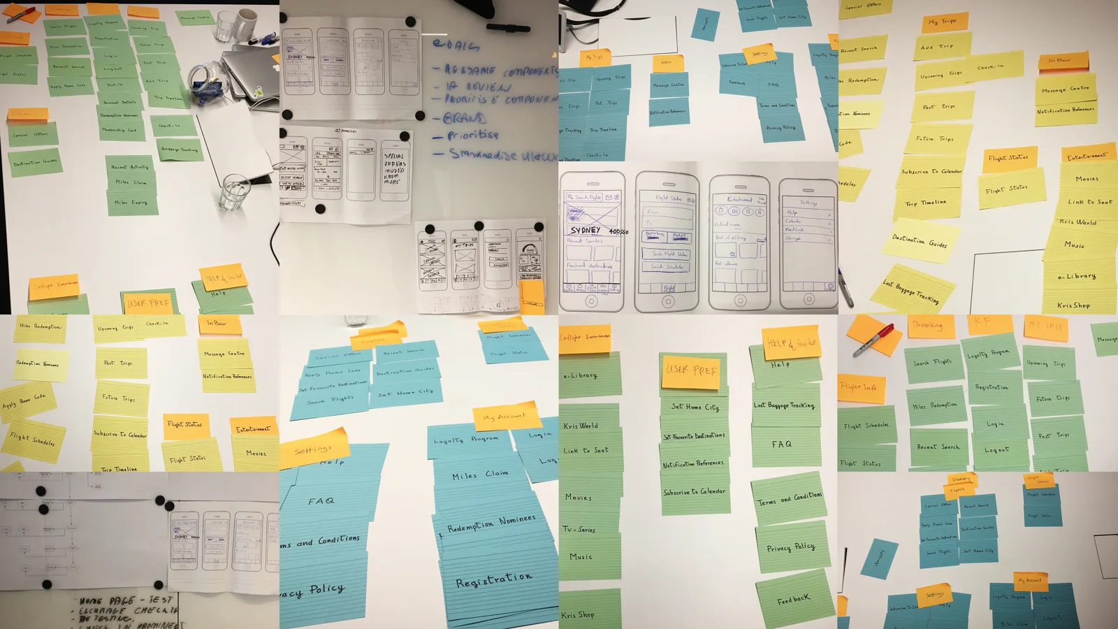
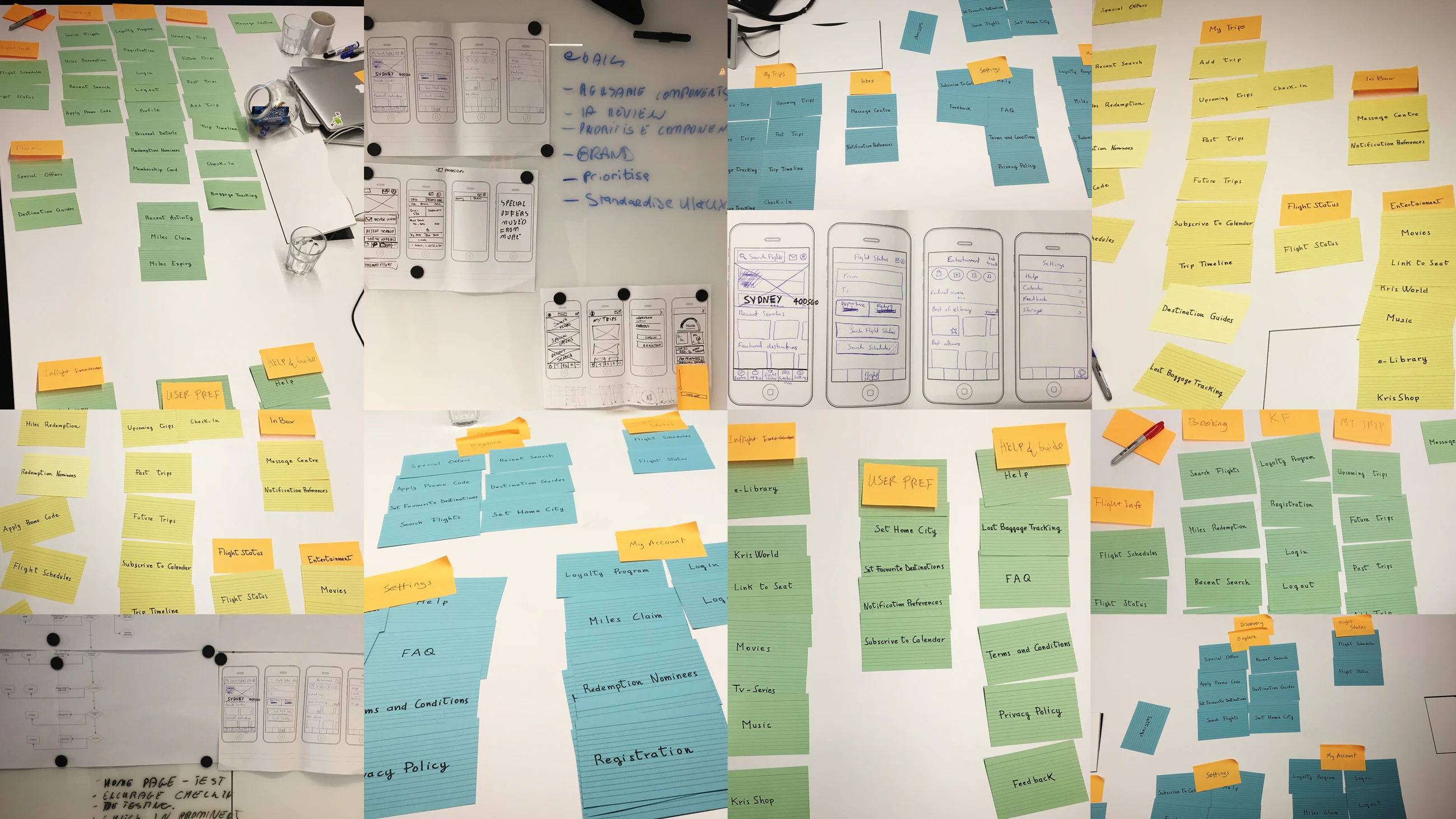
We made card sorting an early part of the work. Before deciding how the interface should look, we needed to understand how travellers expected its content and functions to fit together.
We inventoried the top levels in a spreadsheet, recording each item and its place in the hierarchy. That produced approximately 43 cards. A workshop with Singapore’s business stakeholders validated the exercise and helped explain how it would work with users.
02 / 05
Choose participants with different travel habits
Singapore’s marketing team provided three research segments: Disconnected Traveller, Review Seeker and Digitally Savvy Traveller. These represented different relationships with online planning, mobile use, recommendations and loyalty membership.
The aim was to avoid organising the app solely around the team’s own familiarity with it. Travellers with different habits might use different labels or expect different connections between the same features.
- Disconnected Traveller: infrequent online travel planning and less reliance on a connected phone.
- Review Seeker: regular online use, interest in promotions and recommendations from other people.
- Digitally Savvy Traveller: frequent digital planning, international travel and familiarity with KrisFlyer.
03 / 05
Use an open card sort
I chose open card sorting so participants could create and name their own groups. This allowed us to learn both which items belonged together and the vocabulary people used to describe those groups.
The exercise was emailed to a sample of 1,000 app users. The participation section of the original case records 27 completed exercises, with recurring patterns noticed after 15 participants.
We focused on expected groupings and labels, relationships between high-level concepts and whether users needed more than one route to the same information. The purpose was to make the organisation reflect users’ mental models rather than internal ownership.
04 / 05
Move from “More” to five clear areas
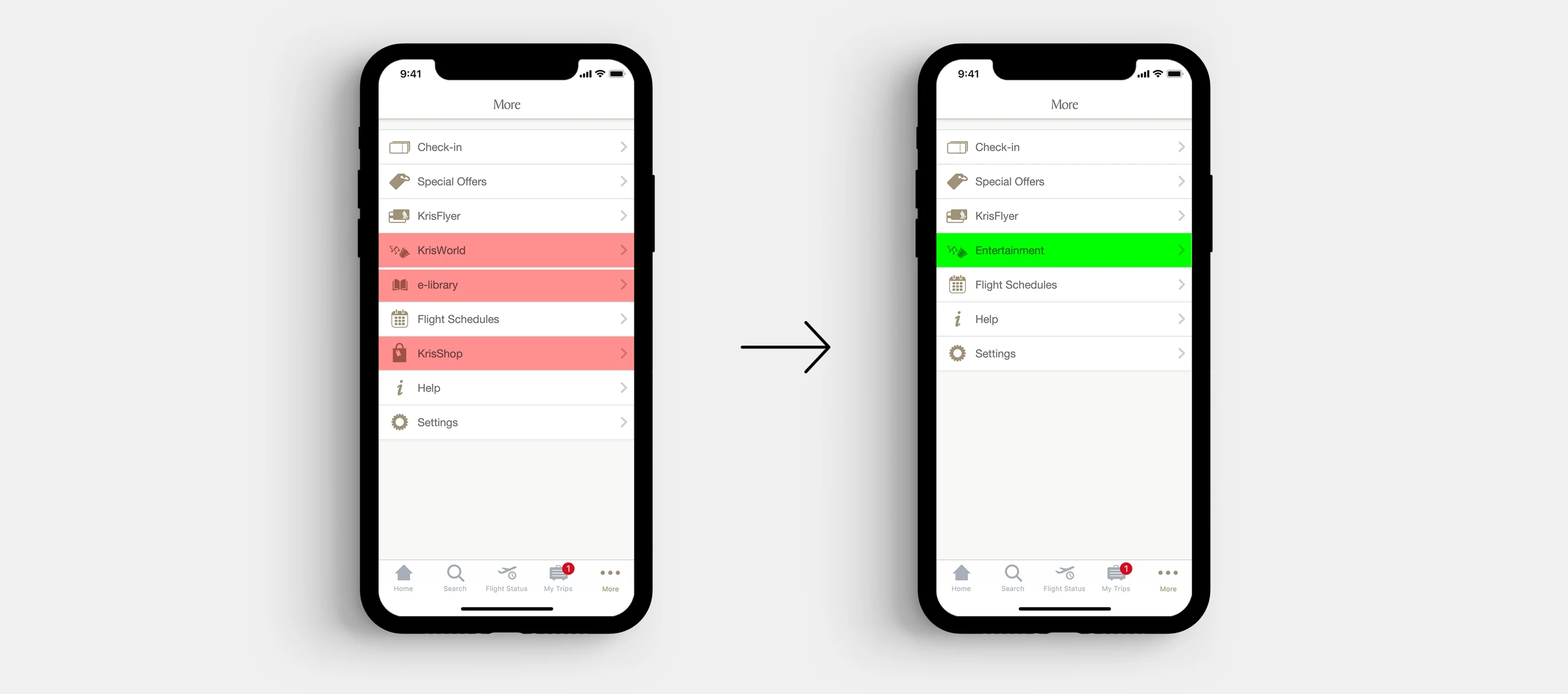
The existing structure had five main tab-bar items and nine items under More. The card-sort findings suggested that users expected a different arrangement.
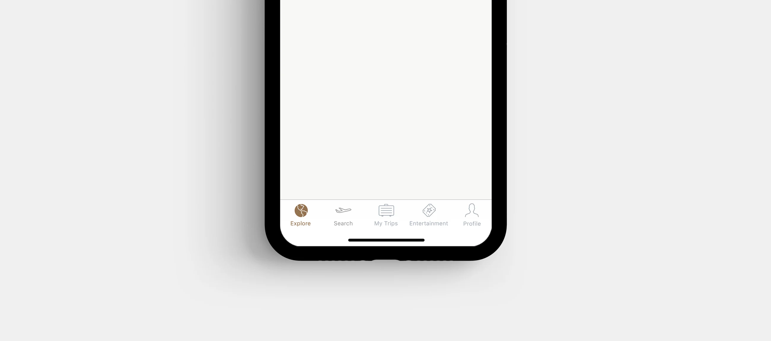
The proposed structure grouped the application into five independent sections: Explore, Search, Trips, Entertainment and Profile. The original work then explored Search, Trips, Entertainment, account and settings within that structure.
This was a proposed information architecture informed by the exercise. The source does not establish a measured change in navigation success after release.
- Explore — discovery and travel inspiration.
- Search — finding travel options.
- Trips — information connected to a journey.
- Entertainment — the inflight content experience.
- Profile — account and settings.
05 / 05
Turn the architecture into a delivery approach
The proposed sequence was to work section by section: Entertainment, Profile, Search, Trips and Explore. Within each area, the team would define and consolidate navigation patterns using an atomic design approach.
This connected the information architecture to implementation: shared patterns could support movement between sections while each section was developed in more detail.
The original case referenced Abby Covert’s How to Make Sense of Any Mess as a framing resource. The practical lesson was to make the purpose and structure explicit before concentrating on visual execution.