Medium already grows.
A previous explanation inferred behaviour from padding that added up to 48.
Native design / Recorded decisions, September 2026
A button could look correct and still fail when its content grew. Inspecting the actual component changed my decision—and the instructions the next AI session would read.

Illustrative reproduction of the recorded vertical sizing rule. These are explanatory diagrams, not Workhuman interface screenshots.
Looks right at the default size.
height: 48The container stays the same as the label grows.
A minimum size, with room to grow.
height: content · min: 48Label line height + vertical padding, with a minimum.
Default: both diagrams are 48 units tall. Appearance alone does not reveal the sizing rule.
The example reproduces the large button’s recorded heights: 48 → 52 → 84. Colour and styling are illustrative. Label wrapping and horizontal sizing were separate, unresolved questions.
Inspect before changing
The existing documentation described the medium button as already sizing to its content. Its padding and icon added up to the visible height, so the explanation looked plausible.
Inspection showed that both sizes were fixed. A button that happens to measure 48 and one that derives 48 from its content look identical at the default size. They behave differently when the label grows.
I had initially decided the change for the large size. With that evidence, I extended the decision to the medium variants: content-driven height, with a minimum of 48.
A previous explanation inferred behaviour from padding that added up to 48.
Actual sizing properties contradicted the written explanation.
The changed scope and its reason became part of the decision record.
A consequence I accepted
The medium loading state contained a larger spinner. I chose to keep it and let the button grow, rather than shrink the spinner to preserve the old height.
Six medium loading variants grew from 48 to 52 in the recorded edit. That change between states was an accepted trade-off, not something to conceal as a perfectly stable layout.
Know which system owns the decision
The native workflow distinguishes an app screen from responsive web, even when both appear at a similar width. It reads the relevant component identity, platform guidance and recorded decisions before choosing a component or text style.
That boundary also exists inside a screen. Product controls and operating-system interface elements have different owners. A blanket instruction to bind every label to product styles could change platform typography rather than fix it.
Product component
Inspect canonical identity, text bindings, content growth and the states the product owns.
Example: the button sizing decision.Operating-system interface
Use platform context. Record where a local design review cannot assess the system’s behaviour.
Example: the alert’s typography was left unchanged.A second recorded decision
I chose a dedicated captions screen. The system file picker still selects the file; the screen provides a stable place to understand what happened next.
Explain what to attach.
Show that work is in progress.
Keep the file visible in its container.
Give the error a readable surface.
The video preview’s bottom controls left no stable area below the action for feedback. Its background was arbitrary video content. A dedicated screen gave the upload, attached file and error a consistent surface. The container stayed in place as its content changed.
State map derived from the September 14 decision record, not an interactive product prototype. The recorded frames were local design work; deletion confirmation and other details remained open.
Preserve the judgement
A useful decision record carries the corrected assumption, what changed, who decided, the consequence and what remains unresolved. That gives the next AI-assisted task something more reliable than the previous explanation.
Recorded decision / September 15, 2026
This account is based on the native-design workflow and dated decision records supplied by Bruno: the September 15 content-driven button decision, the September 14 operating-system alert boundary and the September 14 native-caption screen decision.
The records attribute design decisions to Bruno and assisted execution to Claude. The button record describes source-file edits, not a published library or shipped app update. Measurements shown here come from that historical record; they were not remeasured in the company’s Figma files for this portfolio.
The interactive comparison is a browser reproduction of the vertical sizing mechanism. It does not reproduce Workhuman’s product UI or establish overall accessibility compliance. Company identifiers, internal links and component keys are omitted.
From the source
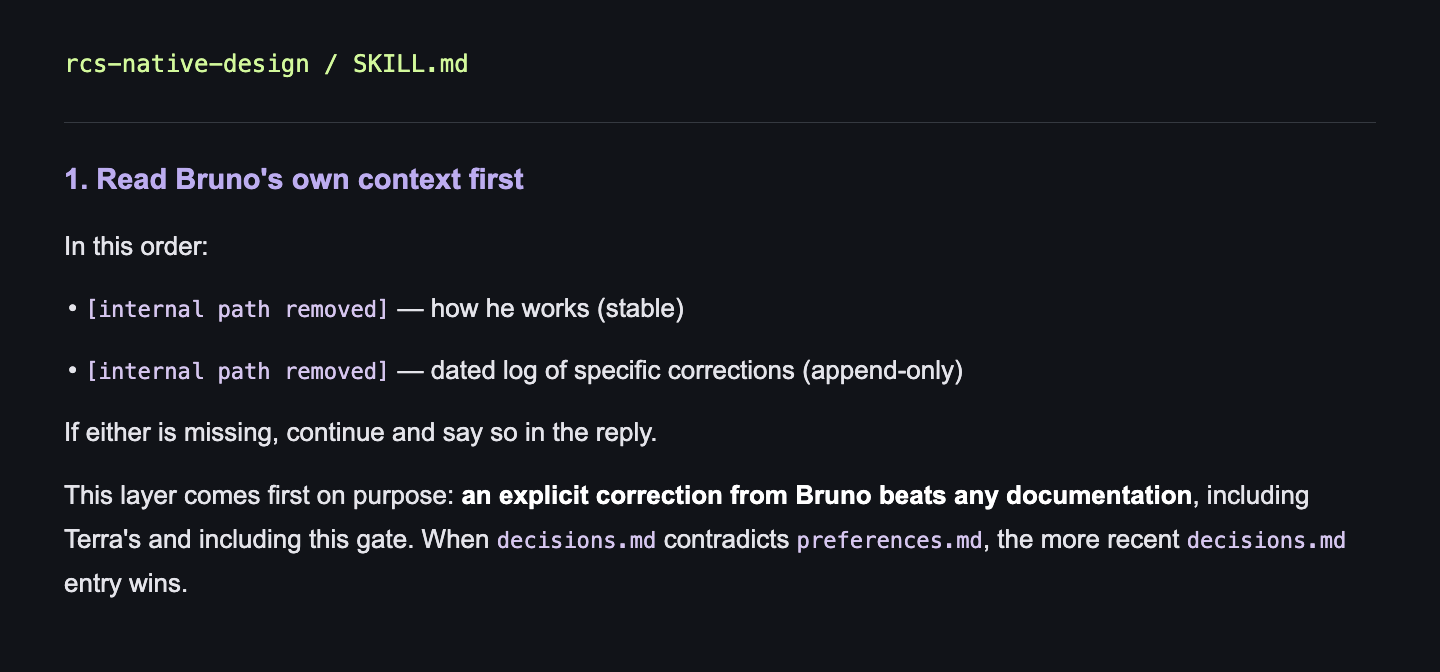
In this order:
• [internal path removed] — how he works (stable)
• [internal path removed] — dated log of specific corrections (append-only)
If either is missing, continue and say so in the reply.
This layer comes first on purpose: an explicit correction from Bruno beats any documentation, including Terra's and including this gate. When decisions.md contradicts preferences.md, the more recent decisions.md entry wins.